It’s time for customizing the ServiceNow instance. In this article I’ll explain you how to create custom CSS themes for your ServiceNow instance.
In our company we wanted to customize our instance with two themes. A light one and a modern looking dark one. The most popular pros of dark themes are, they are battery saving, good to look at and more important, they are better four your eyes 😉 but only if you are working on night-time or dimmer workspaces. When you work in bright environments, a light theme is better for your eyes.
Both themes should be leaned to our corporate identity. So we asked our marketing to get the color codes. Since the color codes are in RGB we had to transform them into hex color codes. You can find a appropriate website below under Related Lists.
Required Roles
admin
UI16
The easiest way to customize the look of your instance is to edit the System Properties -> Basic Configuration UI16 module. In this module you are able to change some popular design options like the following:
| Label | Description | Related System Property |
| Page header caption | Custom Text in the Banner Frame. | glide.product.description |
| Browser tab title | Title of the browser tab. Note: the browser tab title is divided into two sections: the title of the current displayed module and the defined Browser tab title. Both separated by a ‘|’ character.  Knowledge is the current selected module ant ‘ITSM universe – DEV’ is the Browser tab title. | glide.product.name |
| System timezone for all users unless overridden in the user’s record | Select the time zone in the choice list. This is the default time zone every user has initially selected. The user is able to change this time zone in the user settings. You can click on Configure available time zones to prevent the users from selecting unnecessary time zone. | glide.sys.default.tz |
| Banner image for UI16 | Add a custom logo. | glide.product.image.light |
| Date format Time format | Select the date and time formats from the choice lists | glide.sys.date_format Glide.sys.time_format |
| Header background color | Color for the Banner Frame background.  | css.$navpage-header-bg |
| Banner text color | Color for the Banner Frame text. | css.$navpage-header-color |
| Header divider stripe color | Color for the divider between the Banner Frame and the Application Navigator. | css.$navpage-header-divider-color |
| Navigation header/footer | Color for the header/footer of the Application Navigator section. | css.$navpage-nav-bg |
| Navigation background expanded items | Background color for the expanded modules in the Application Navigator. | css.$subnav-background-color |
| Module text color for UI16 | Color for the module text. | css.$navpage-nav-color-sub |
| Navigation selected tab background color | Color for the active tab in the Application Navigator. | css.$navpage-nav-selected-bg |
| Navigation selected tab divider bar color | Color of the divider of the active tab and the Application List in the Application Navigator. Note: This color is also used as part of the theme preview on the Themes tab under system settings. | css.$nav-highlight-bar-active |
| Navigation unselected tab divider bar color | Color of the divider of the inactive tab and the Application List in the Application Navigator. | css.$nav-highlight-bar-inactive |
| Navigationseparator color | Color for the divider of navigation separator. | css.$nav-hr-color |
| Background for navigator and sidebars | Background color of the navigator and sidebars.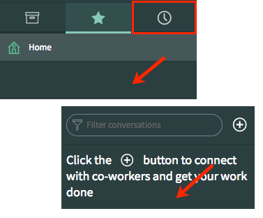 | css.$navpage-nav-bg-sub |
| Currently selected Navigation tab icon color for UI16 | Color of the active Navigation tab icon. | css.$navpage-nav-selected-color |
| Unselected navigation tab icon and favorite icons color | Color of the inactive Navigation tab icon. | css.$navpage-nav-unselected-color |
| Border color for UI16 | Select or enter the color. Also affects the border of the Filter conversations search box in the Connect Chat sidebar. | css.$navpage-nav-border |
| Selected base theme | Switches the main content (everything other than the application navigator and the header) between the La Jolla and Cobalt themes. | glide.ui.base_theme.selected_theme |
Do not forget to Save your settings. 😉
Base Theme
Maybe you are asking yourself, what the base theme is as I have done. Therefore I want to provide clarity.
The two base themes are ‘La Jolla’ and ‘cobalt’. La Jolla is the new brand theme for ServiceNow. Since the Upgrade from previous Versions to Madrid, the theme is automatically upgraded to the La Jolla theme. Any customizations you have made to the system will not be upgraded.
CSS class support
With CSS variables you have more power to customize the look of the instance than with the Basic Configuration UI16 module.
| CSS class | Description | How to configure | Affected area |
| $navpage-header-bg | Header background color | Navigate to System Properties > Basic Configuration UI16 > Header background color | |
| $navpage-header-color | Color for header text and the global search icon | Navigate to System Properties > Basic Configuration UI16 > Banner text color | |
| $navpage-header-button-color | Color for logged in user name text, and the global searchConnect, Help, and settings icons | Add the CSS property to the CSS field of a theme. For more information, see Create or customize a theme. |  |
| $navpage-header-divider-color | Header divider color | Navigate to System Properties > Basic Configuration UI16 > Header divider stripe color | |
| $navpage-button-color | Color for the following icons in the sidebars Expand/collapse Create a conversation (in the Connect sidebar) Open Connect workspace | Add the CSS property to the CSS field of a theme. For more information, see Create or customize a theme. |  |
| $navpage-button-color-hover | Color for the following icons when a user points to the control: Global search Help Settings Clear text icon in the navigation filter | Add the CSS property to the CSS field of a theme. For more information, see Create or customize a theme. |   |
| $search-text-color | Color of the search text, both in the navigation filter and the global search fields | Add the CSS property to the CSS field of a theme. For more information, see Create or customize a theme. |  |
| $navpage-nav-border | Border color for the navigation filter and the conversation filter | Navigate to System Properties > Basic Configuration UI16 > Border color for UI16 | |
| $nav-highlight-main | Highlights the module after the user has clicked it. In the Connect workspace, highlights the selected conversation. | Add the CSS property to the CSS field of a theme. For more information, see Create or customize a theme. |  |
| $subnav-background-color | Background for expanded navigation items | Navigate to System Properties > Basic Configuration UI16 > Navigation background expanded items | |
| $navpage-nav-bg | Header and footer for navigator and sidebars. | Navigate to System Properties > Basic Configuration UI16 > Navigation header/footer | |
| $navpage-nav-bg-sub | Background for navigator and sidebars | Navigate to System Properties > Basic Configuration UI16 > Background for navigators and sidebars | |
| $navpage-nav-color-sub | Text color for modules in the main navigation | Add the CSS property to the CSS field of a theme. For more information, see Create or customize a theme. |  |
| $navpage-nav-mod-text-hover | Text color when hovering over items in the main navigation | Not supported | Not supported |
| $nav-hr-color | Navigator separator color | Navigate to System Properties > Basic Configuration UI16 > Navigation separator color | |
| $nav-highlight-bar-active | Line under the active tab in the application navigator. This color is also used as part of the theme preview on the Themes tab under system settings. | Navigate to System Properties > Basic Configuration UI16 > Navigation selected tab divider bar color | |
| $nav-highlight-bar-inactive | Line under the inactive tabs in the application navigator | Navigate to System Properties > Basic Configuration UI16 > Navigation unselected tab divider bar color | |
| $navpage-nav-selected-bg | Navigation selected tab background color | Navigate to System Properties > Basic Configuration UI16 > Navigation selected tab background color | |
| $navpage-nav-selected-color | Currently selected Navigation tab icon color | Navigate to System Properties > Basic Configuration UI16 > Currently selected Navigation tab color for UI16 | |
| $navpage-nav-unselected-color | Unselected navigation tab icon and favorite icons color | Navigate to System Properties > Basic Configuration UI16 > Unselected navigation tab icon and favorite icons color | |
| $connect-latest-message | Color of the currently selected message in Connect | Add the CSS property to the CSS field of a theme. For more information, see Create or customize a theme. | 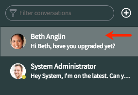 |
| $nav-timeago-header-color | Timestamp header backgrounds in History tab | Not supported | Not supported |
| $navpage-nav-app-text | Core content text color for items such as applications and the empty state text for the Connect sidebar. | Add the CSS property to the CSS field of a theme. For more information, see Create or customize a theme. |  |
| $navpage-nav-app-text-hover | Text color for a selected module | Add the CSS property to the CSS field of a theme. For more information, see Create or customize a theme. |  |
Add Theme
I’ll provide you two examples of themes, a dark and a light one. Maybe you’ll need to play with your color variables to get the best suited design for your instance. In some cases you could set one color to two variables and the worst could be to no longer see your text. The best is to test your custom CSS themes in your companies dev instance or your personal dev instance. 😉
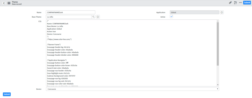
To upload your custom theme, go to System UI -> Themes and click New.
You have to provide the following information:
Name: provide a name for your theme like COMPANYNAMELight or COMPANYNAMEDark.
Base Theme: Selest a base theme. As you learnd, select the La Jolla theme.
Application: keep Global.
Active: select if you are ready to offer the theme for your coworkers.
CSS: provide the CSS variables and settings in the following format:
$navpage-header-bg: #3c3c3c
Device: select one of the following from the Device choice list to identify the user interface version for the theme:
| Option | Description |
| Browser | Identifies a Legacy: UI11 theme. |
| Doctype | Identifies a UI15 theme. |
| Concource | Identifies a UI16 theme. |
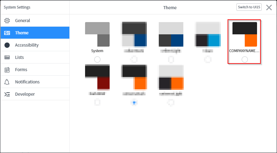
To apply the theme, go to Settings in the Banner Frame, Theme and then choose your preferred theme.
Note: When you are already creating themes for the prod instance, keep thinking on create one single theme with other colors for your dev or each other instance in order to be able to distinguish them visually quickly.
Download
Referred Links
https://docs.servicenow.com/bundle/newyork-platform-user-interface/page/administer/navigation-and-ui/reference/customizing-instance-appearance.html
https://www.color-hex.com/
https://docs.servicenow.com/bundle/newyork-platform-user-interface/page/administer/navigation-and-ui/task/t_ConfigureLogoColorsSysDfltsUI16.html

 Fix IT - today.